Yale School of Art
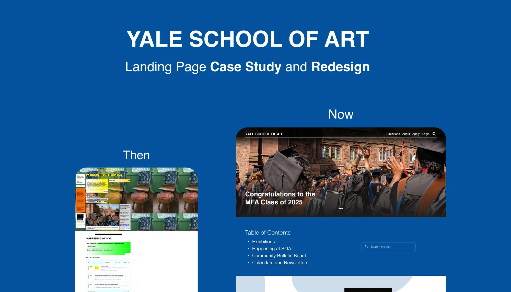
A UX audit and redesign of the Yale School of Art homepage, turning a cluttered wiki into a clear, accessible front door.
Overview
- Role
- Product Designer
- Platform
- Website
The problem
Imagine you want to study at the Yale School of Art. You open the homepage to learn about the programmes, and this is what you see.
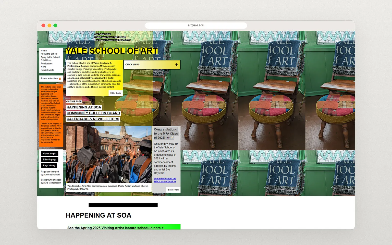
Tiled photos, clashing colours, boxes of text everywhere and no clear place to start. You leave without finding what you came for.
What I found
I audited the homepage and found 12 issues. These were the biggest:
- Visual clutter and no hierarchy. Visitors don’t know where to look or how to start.
- No clear purpose. First-time visitors, like prospective students, feel lost or unwelcome.
- Clashing colours and mixed fonts. Important content is hard to read.
- Poor accessibility. The page breaks WCAG guidelines on contrast and alt text, so it is hard to use with a screen reader or keyboard.
- Not responsive. On phones, text overlaps and menus disappear.
- No search. Visitors can’t quickly find what they need.
The others: inconsistent navigation, too much content at once, scattered low-quality images, no layout grid, and dead links to outdated content. For an art school, the design felt surprisingly amateurish.
Was the chaos on purpose?
Partly, maybe. The site is a wiki that anyone in the school community can edit, and its experimental look may reflect a student-driven, anti-corporate culture. But intention doesn’t fix the result: visitors still can’t find their way, and many can’t use it at all.
So the redesign keeps the school’s content and community voice, and gives it structure.
The redesign
A clear front door
The homepage now opens with one strong image and one message: “Congratulations to the MFA Class of 2025”. A fixed top bar holds only the essentials: Exhibitions, About, Apply, Login and search. Below it, a short table of contents and a search box show everything on the page at a glance.
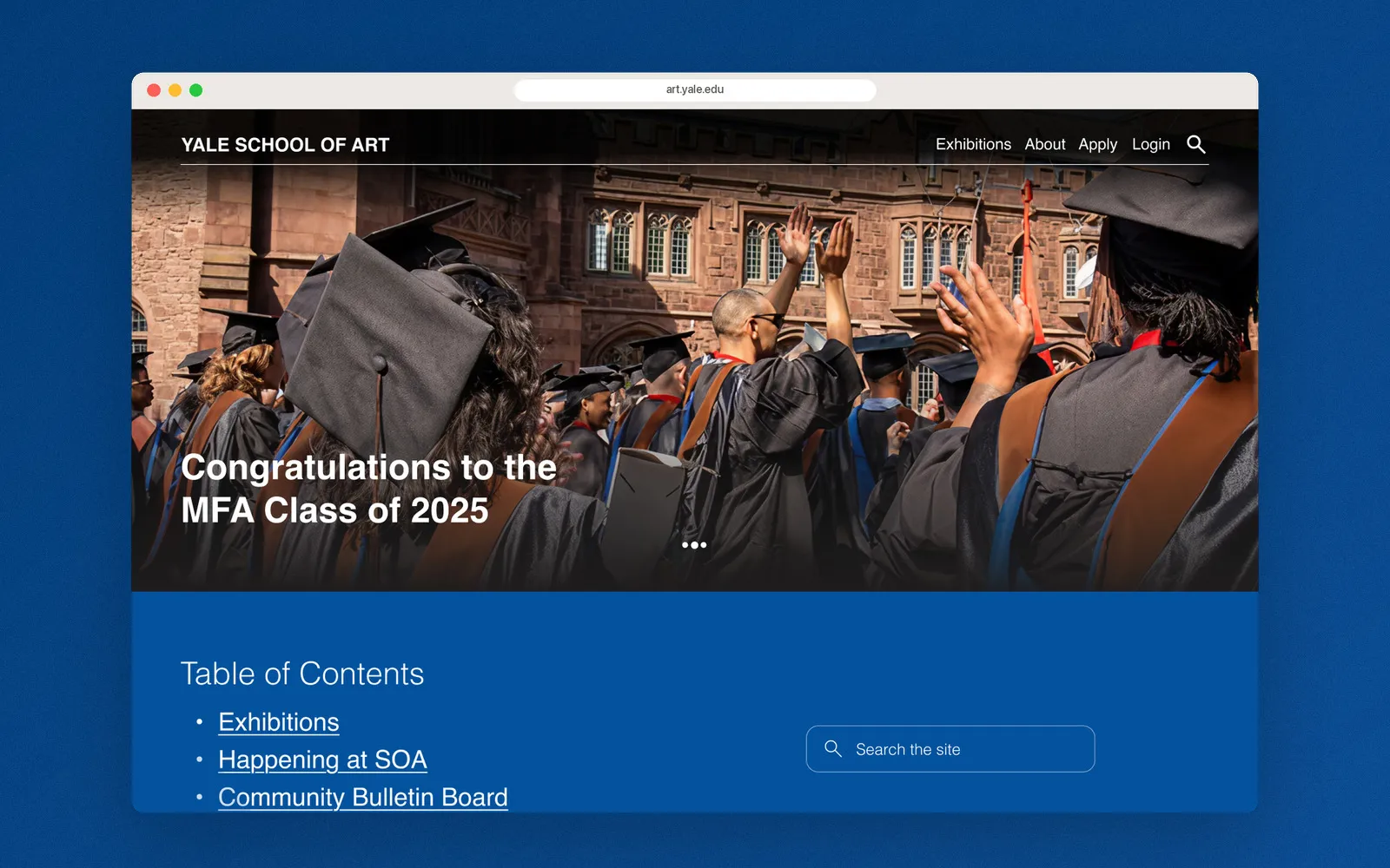
Same content, now in order
Every section from the original page is still there: Exhibitions, Happening at SOA, the Community Bulletin Board, and Calendars and Newsletters. Each now has a clear heading, consistent spacing, and one type scale and colour palette on a 12-column grid.
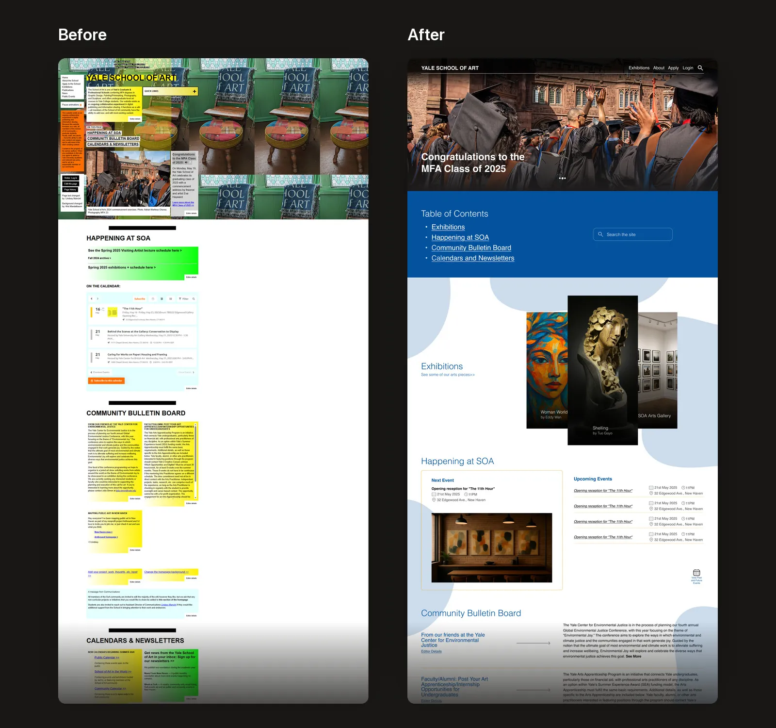
Readable community posts
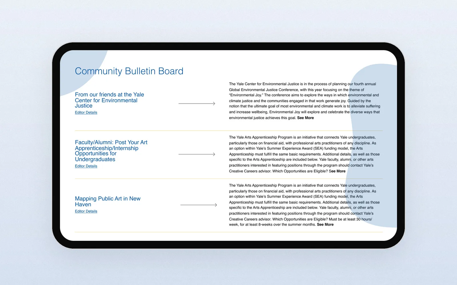
The Community Bulletin Board still welcomes posts from anyone, but each one now has the same layout: a title, the editor’s details, and a short summary with “See More”. Contrast and alt text follow WCAG, and the layout adapts to any screen size.
The result
The redesigned homepage gives a prospective student what the original couldn’t: a clear place to start, readable content and a way to search. It still keeps the community voice that makes the School of Art what it is.