Zyptyk
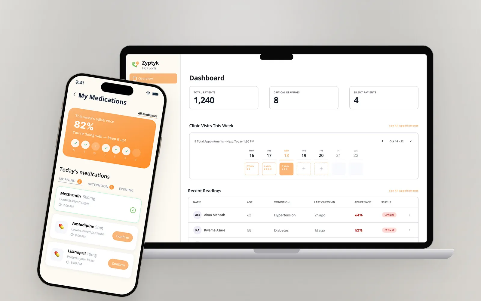
An AI-powered healthcare platform that helps patients manage cancer, diabetes and hypertension, and gives practitioners and pharmacies the tools to coordinate their care.
Overview
- Role
- Product Designer
- Platform
- Mobile app, Web app
- Tools



The problem
Managing cancer, diabetes, and hypertension often requires patients to keep track of medications, monitor health readings, attend appointments, and stay connected with healthcare professionals. When these activities are spread across different platforms, paper records, and phone calls, staying on top of everyday care can become overwhelming.
Zyptyk aims to bring these essential activities into one accessible healthcare platform, making it easier for patients to manage their care and for healthcare practitioners and pharmacies to coordinate patient support.
The challenge was to make the experience intuitive, easy to navigate, and approachable for users with varying levels of digital literacy, particularly older adults.
My role
As the Product Designer, I worked on improving the user experience across Zyptyk’s mobile and web platforms. My focus was simplifying complex healthcare workflows, improving information architecture, and designing intuitive interfaces for patients, healthcare practitioners, and pharmacies.
I also explored how AI could support patients with everyday healthcare tasks without making the entire experience dependent on a conversational interface.
Process
I approached the project by identifying the core needs of each user group and the essential tasks they needed to complete. For patients, that meant logging readings, taking medication, keeping appointments and reaching their care team. For practitioners, it meant knowing which patients need attention and acting on it.
I focused on simplifying navigation, making important information easier to find, and reducing the effort required to complete everyday healthcare activities. I also considered accessibility, readability, and the needs of older adults when exploring interface layouts and interactions. Throughout, I prioritised clear visual hierarchy, familiar interaction patterns, and consistency with Zyptyk’s existing brand identity.
Five design decisions guided every screen:
- Navigation over a chat-first experience. AI complements conventional navigation rather than replacing it. Patients can reach appointments, medications, health records, and messages directly.
- Simplicity over information density. Clear labels, readable text, and focused layouts help users understand information and complete tasks without unnecessary complexity.
- Proactive care over passive tracking. Upcoming appointments, medication reminders, and health readings are easy to find when users need them.
- Accessibility over visual complexity. Familiar patterns and straightforward interactions accommodate users with varying levels of digital confidence.
- Connected care over fragmented workflows. The mobile and web experiences serve different users while supporting a shared goal: making patient care easier to manage and coordinate.
The rest of this case study follows a patient’s day, then a practitioner’s, to show those decisions at work.
A patient’s day
Morning: one screen, one next step
The day starts on the home screen. It greets the patient by name and answers the two questions that matter first: what were my last readings, and am I keeping up with my medication? Blood pressure, blood glucose, and this month’s adherence sit at the top in large, plain numbers.
Below them is a single next step: today’s check-in, which “only takes 2 minutes” and goes to the patient’s nurse. There is never a question of where to begin. Large shortcuts to My Medicines and Your Progress, and a bottom bar covering every core area, keep everything else one tap away.
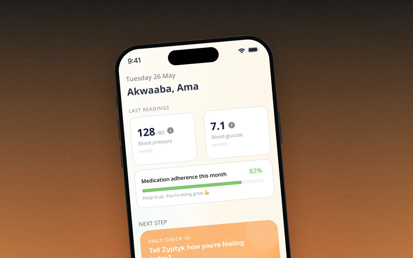
Proactive care over passive tracking. The app tells the patient what to do next instead of waiting to be explored.
A check-in that feels like a conversation
The check-in is where AI earns its place. Instead of a form, an AI assistant asks whether the patient took their Metformin, then asks about their blood pressure. When the patient answers “128 over 80”, it reads the number back in plain language (“that’s a really good reading”) and moves on to how they are feeling. Quick replies and a voice button mean answering takes a tap, not typing.
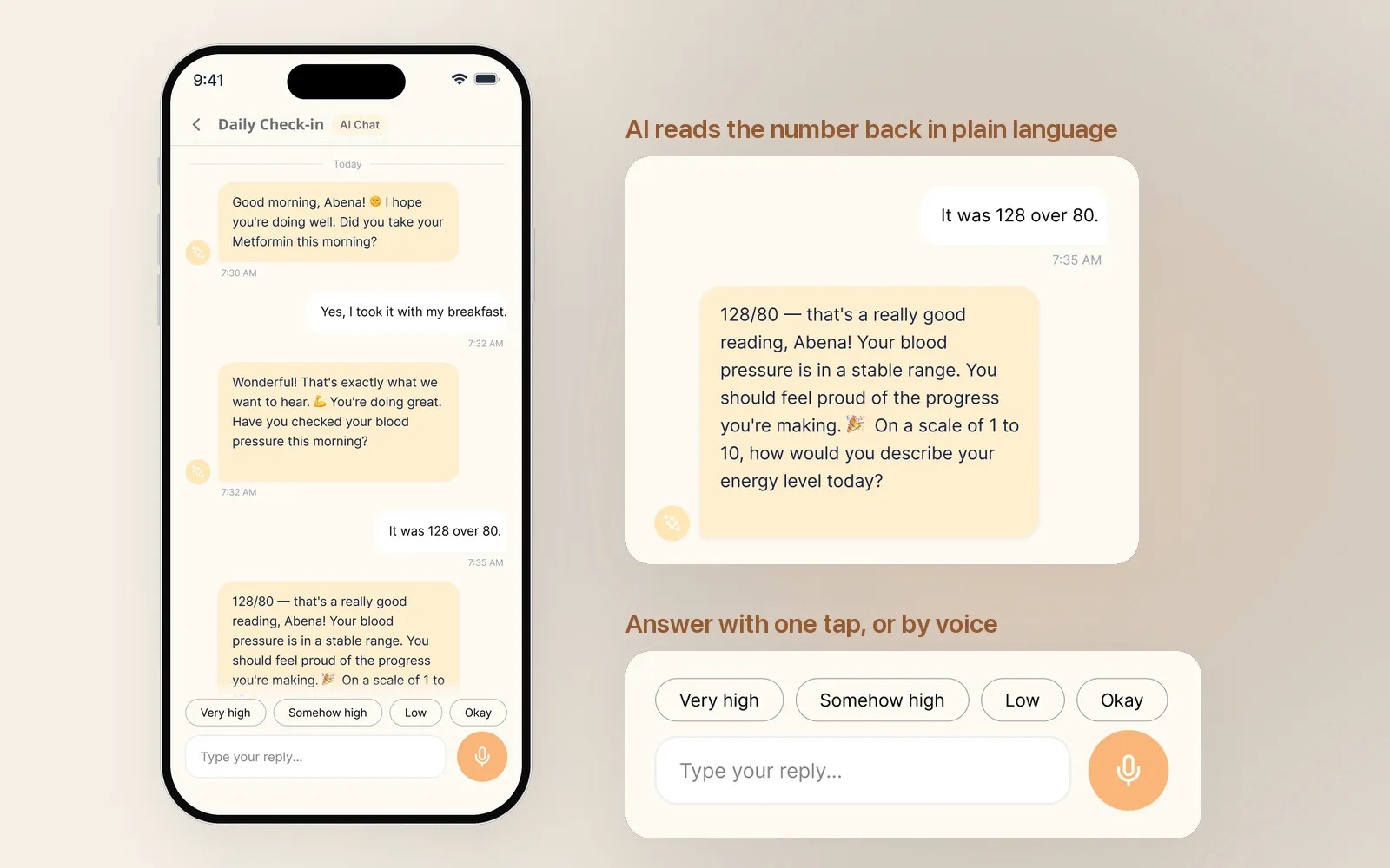
AI is a helpful destination, not the front door. It lives in the Chat tab, right beside direct messaging with healthcare professionals.
Navigation over a chat-first experience. Patients can always reach their care directly, and AI is there when it helps.
Logging a reading in one screen
When the patient takes a reading at home, Log Reading asks for exactly what is on the meter: choose blood pressure or sugar, type the two numbers into large fields, confirm the day, and save. Past readings sit just below.
On Your Progress, every chart comes with a sentence that explains it, such as “Your blood pressure is coming down steadily. Keep going!” The patient understands the trend without having to read the axes.
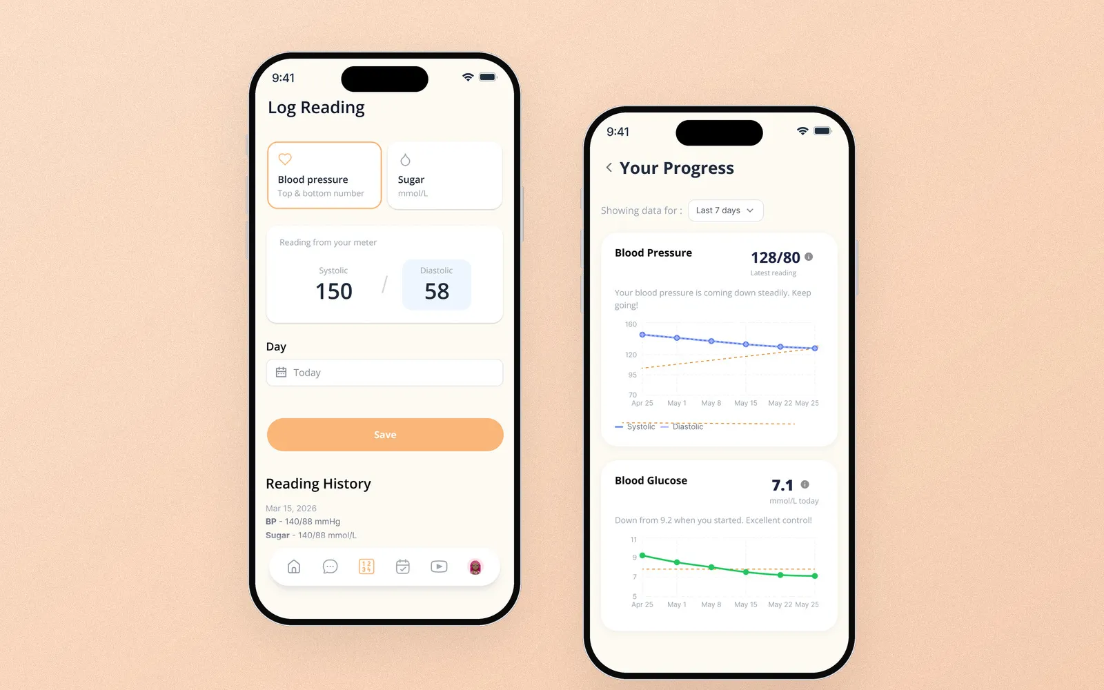
Simplicity over information density. One task per screen, and every number explained in words.
Staying on top of medication
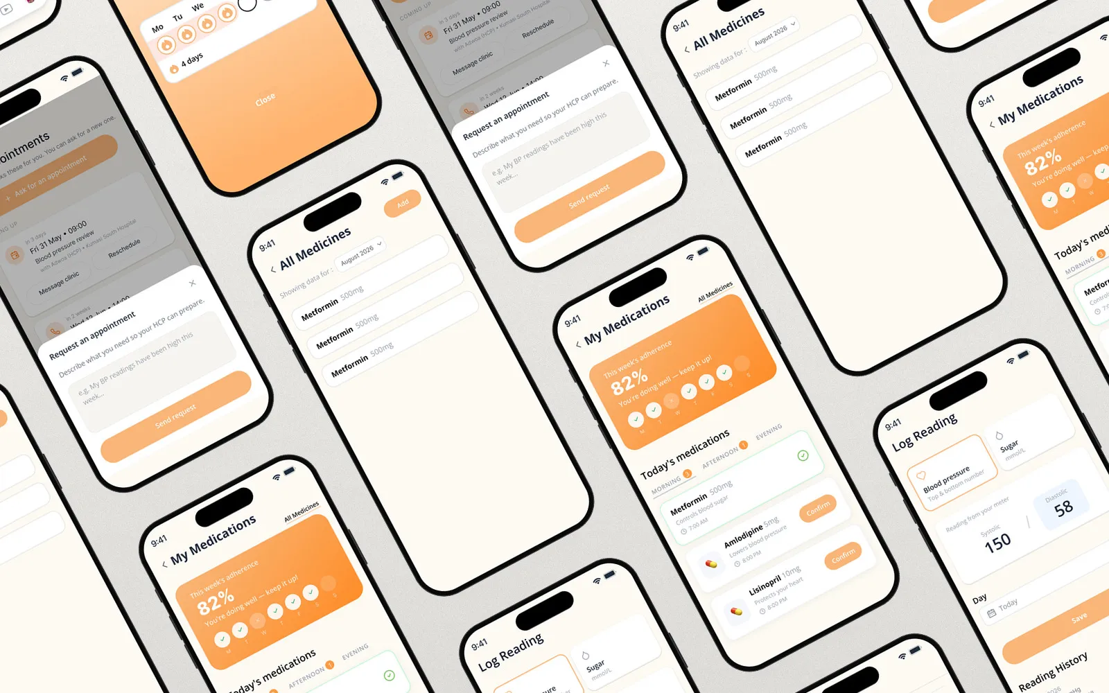
My Medications opens with the week’s adherence and today’s doses, grouped into morning, afternoon, and evening. Each dose has a single Confirm button. From there, the patient can see every medicine, open one to check its dosage, notes, and a calendar of taken and missed days, or add a new one with a short form.
Consistency gets celebrated: after four days of taking every dose on time, the app says so with a streak.
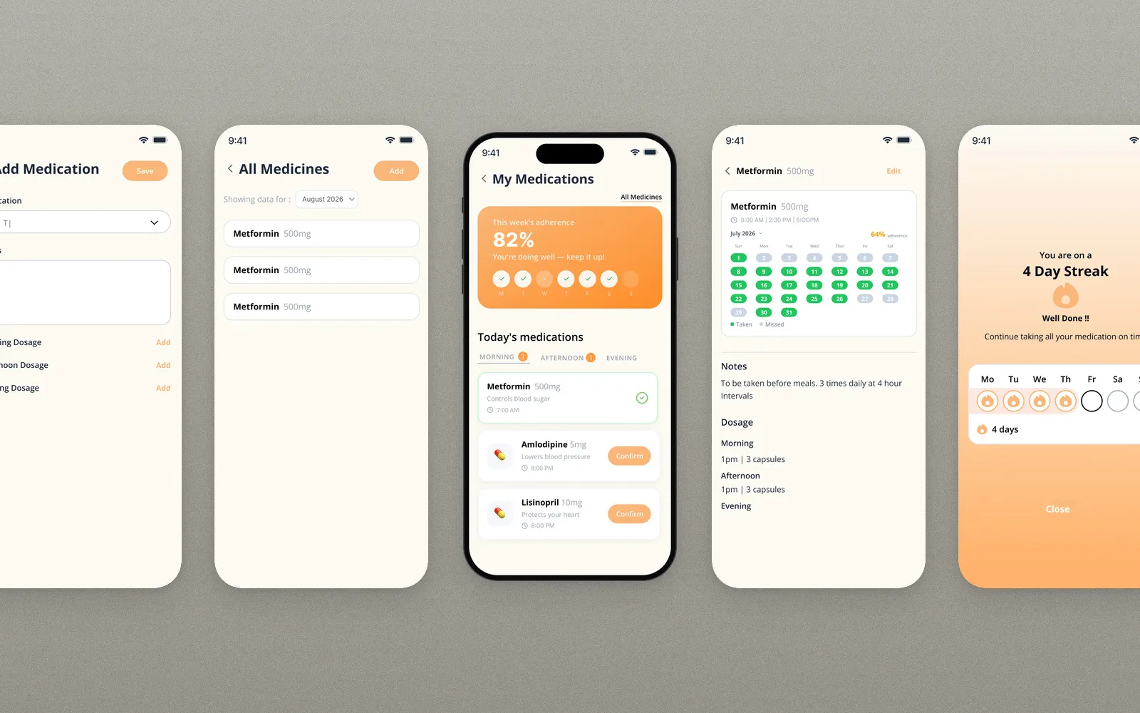
Proactive care over passive tracking. Today’s doses come first, with one clear action each.
Between visits
The clinic books appointments, so the patient simply sees what is coming up, such as a blood pressure review or a phone call for a quarterly diabetes check, with buttons to message the clinic or reschedule. If they need to be seen sooner, they ask for an appointment in a single text box, describing what they need so their healthcare professional can prepare.
In between, Learn offers short videos filtered by condition, such as a two-minute look at how everyday salt affects the heart.
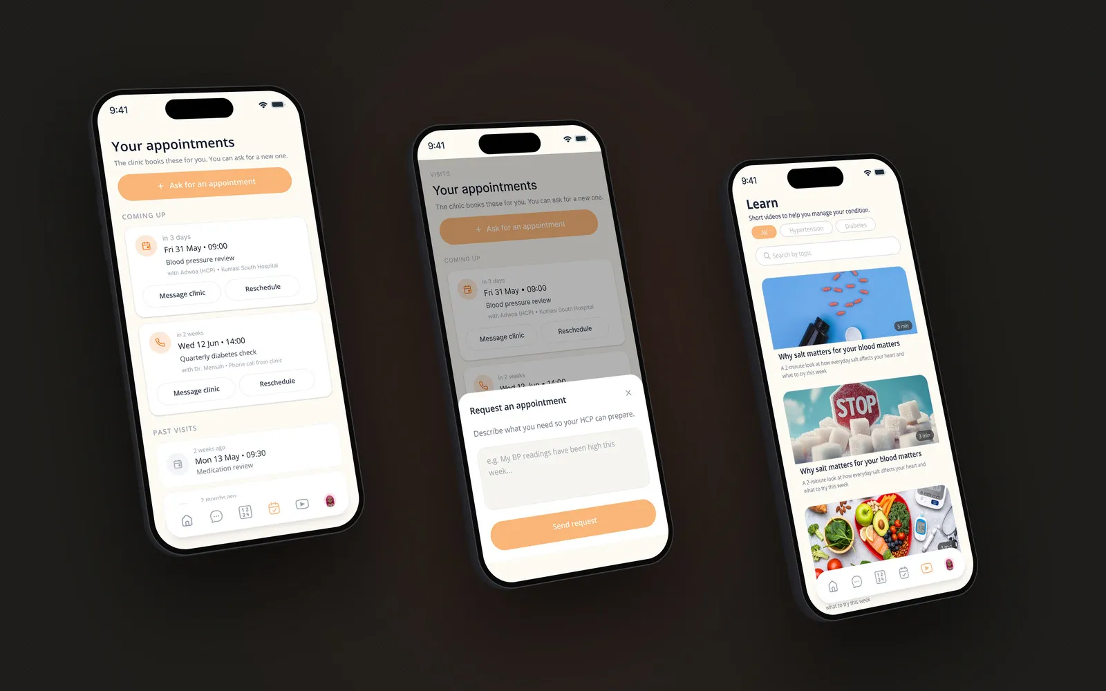
Accessibility over visual complexity. Familiar cards and buttons, and one text box instead of a booking form.
A practitioner’s day
Signing in
Healthcare professionals use the Zyptyk HCP portal on the web. They sign in with Google or email, and new practitioners complete a three-step onboarding covering their identity, their facility, and a final review.
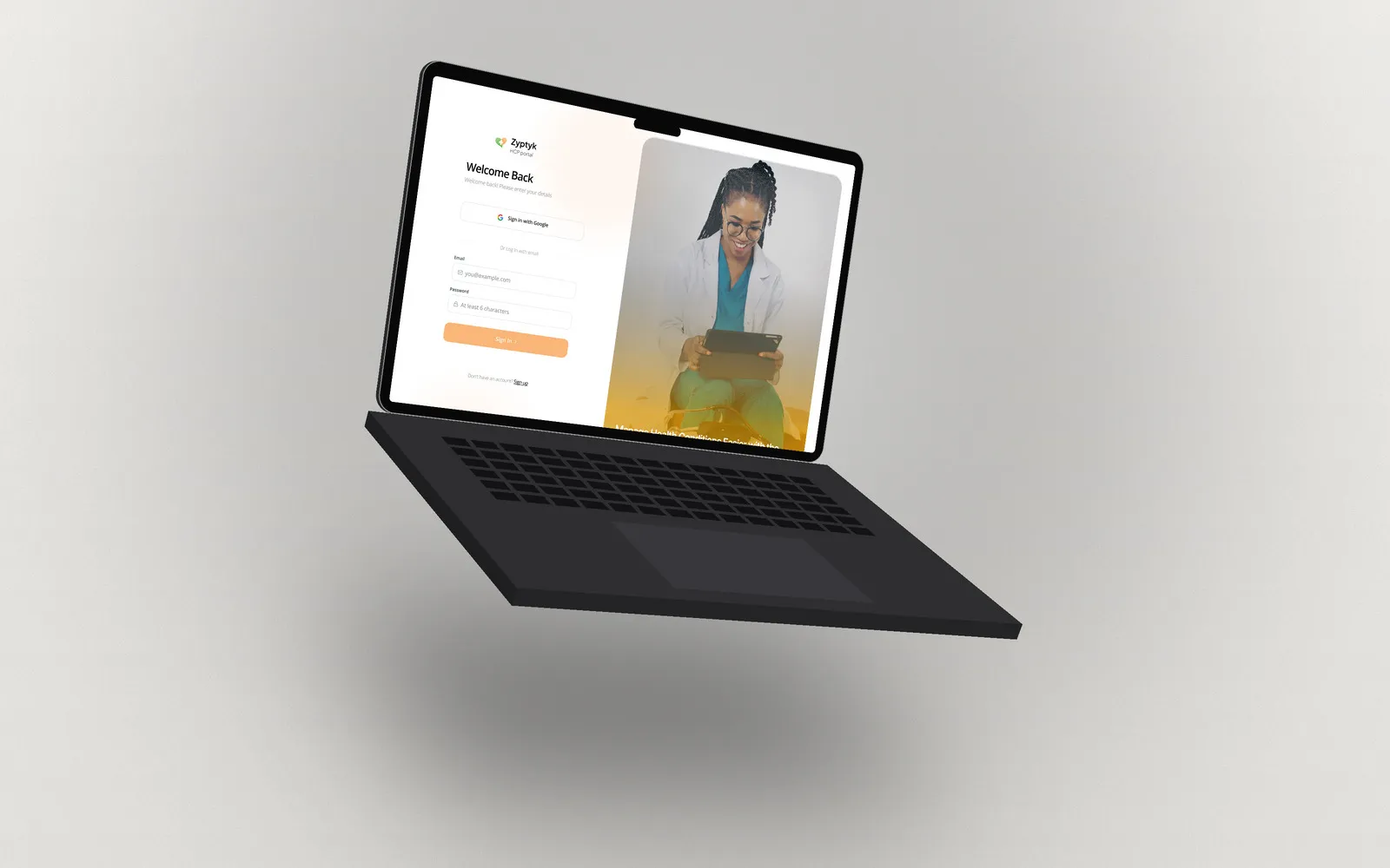
Seeing who needs attention first
The dashboard opens with three numbers: total patients, critical readings, and silent patients who have stopped checking in. Below are this week’s clinic visits and a table of recent readings, each with the patient’s adherence and a status: Critical, Caution, Silent, or Stable.
The Patients list uses the same statuses and can be filtered by condition and status, so the people who need a call today rise to the top.
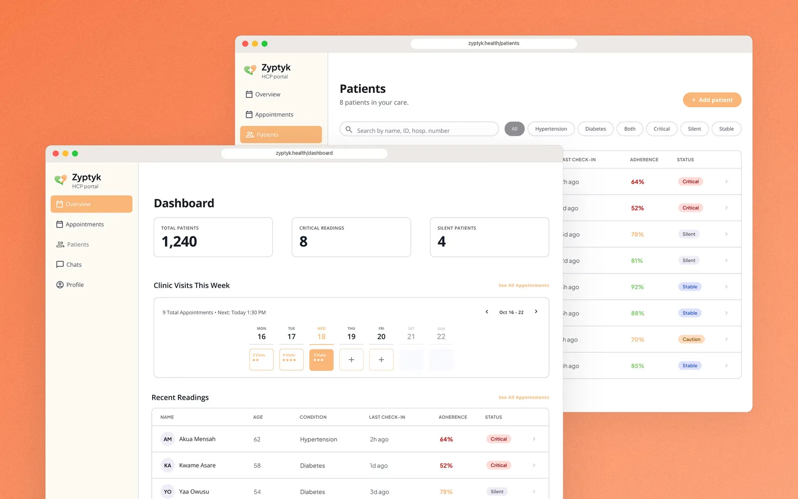
Proactive care over passive tracking. The practitioner sees who needs help before searching for anyone.
One patient, the whole picture
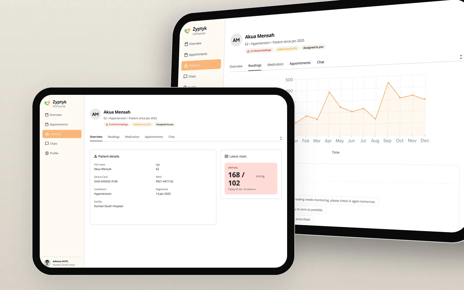
Opening a patient shows the essentials at the top: their condition, adherence, and any critical readings. Tabs cover the overview, readings, medication, appointments, and chat. The overview pairs patient details with the latest vitals, where a critical 168/102 reading stands out in red. The readings tab charts blood pressure over the year, with each reading listed below.
Where the two sides meet
A message, answered
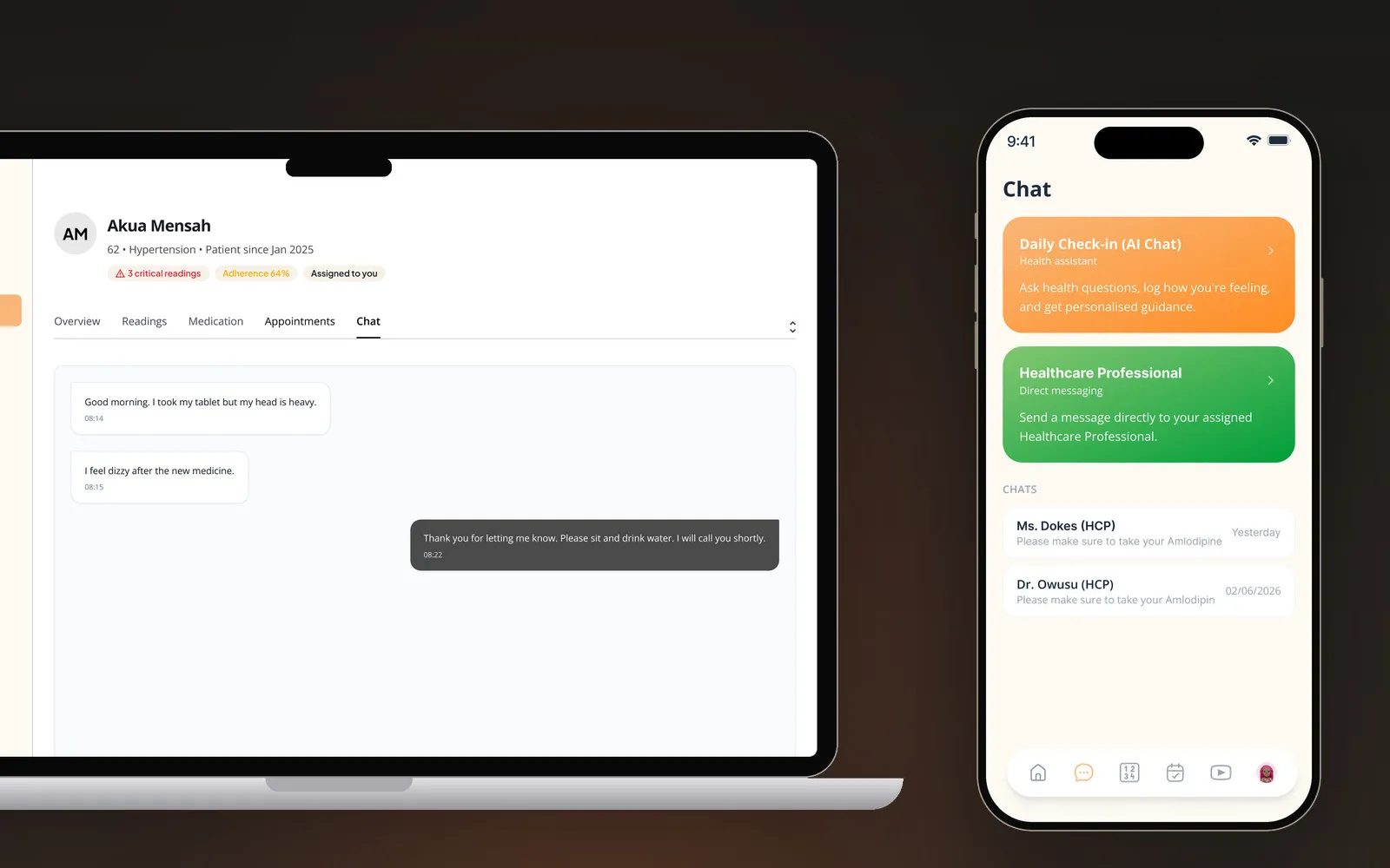
A patient writes, “I feel dizzy after the new medicine.” It arrives in the practitioner’s chat for that patient, and the reply (“Thank you for letting me know. Please sit and drink water. I will call you shortly.”) reaches the patient in the Healthcare Professional section of their Chat tab.
An appointment, set
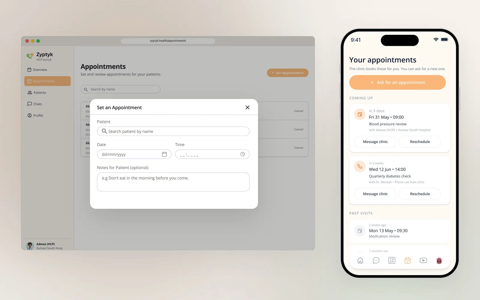
The practitioner sets an appointment by searching for the patient, picking a date and time, and adding a note in plain language, such as “Don’t eat in the morning before you come.” It then appears in the patient’s upcoming appointments, with the practitioner and hospital named.
Connected care over fragmented workflows. Each side of Zyptyk is designed for its own user, and everything one side does shows up on the other.
Outcome
Zyptyk’s design direction brings essential healthcare management tasks into a more unified and accessible experience across mobile and web. By combining patient self-management, healthcare communication, practitioner and pharmacy workflows, and AI-powered assistance, the platform is designed to support more coordinated care.
The project reinforced the importance of designing healthcare experiences around patients’ real needs, making critical information easy to find and technology easier to use.